 May 22, 2025
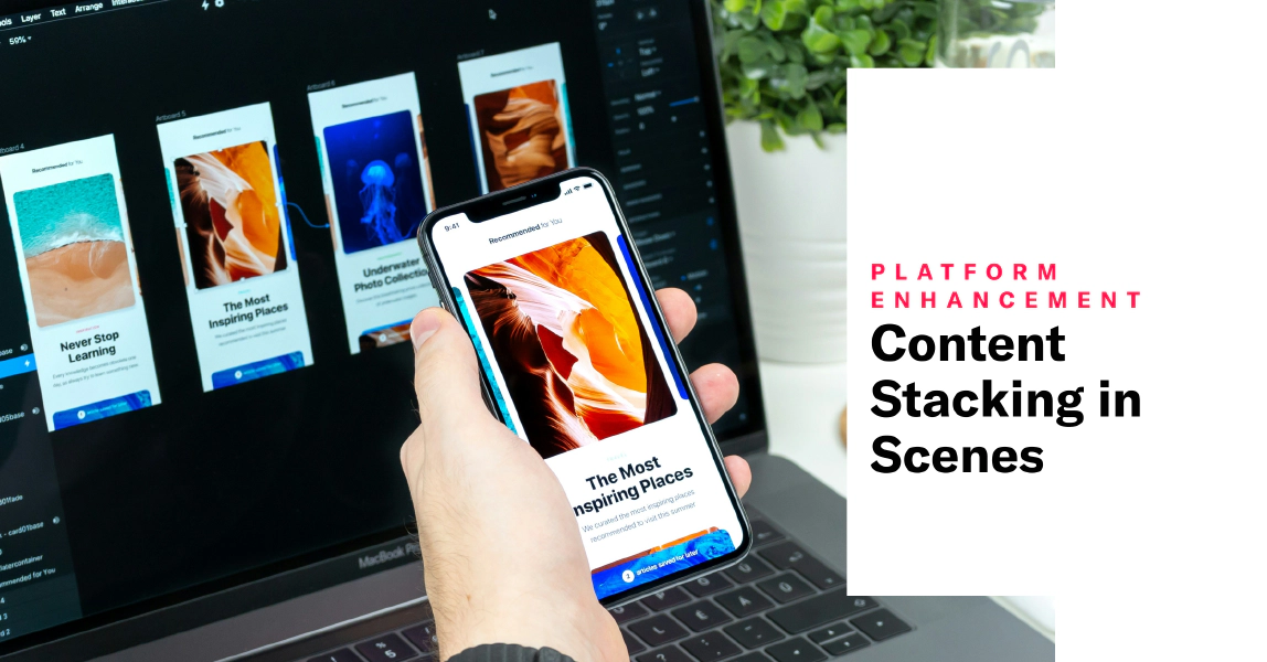
Content Stacking in Scenes
Enhance your Scene designs with content stacking and border options. Plus, updates to project settings help avoid configuration errors.
Today’s release for ScenesA single or multi-screen in-app experience cached on users’ devices and displayed when users meet certain conditions in your app or website, such as viewing a particular screen or when a Custom Event occurs. They can be presented in fullscreen, modal, or embedded format using the default swipe/click mode or as a Story. Scenes can also contain survey questions. provides greater creative control and an improved workflow for project settings.
Stacked content
In addition to horizontal and vertical arrangement for content elements, now you can stack them. Stacking arranges content elements on top of each other, front to back. The first added element is at the bottom (furthest back), and the last is on top (front).
When configuring the design properties for the Container element, select Stacked for the Direction setting. To rearrange the order in a stacked Container, select and hold the drag handle icon () for an element, then drag and drop to a new position.
See the Container content element in Configuring Scene content.
View style border settings and focused configuration
We moved the configuration of the default settings for fullscreen and modal view styles to a dedicated modal window. This change automatically presents the currently selected view style in the preview and helps minimize the risk of modifying the wrong one in error.
From your list of view styles in Settings:
- Select the eye icon () to preview the view style.
- Select the compose icon () to access its settings and preview.
When configuring the defaults for your modal view styles, you’ll see new settings for border color and size.
See Set fullscreen and modal view styles in In-App Experience Defaults.
Requirements and documentation
Scenes are an AXP feature. Not using Scenes yet? Check out About Scenes.
Categories